Off and on again
I started working on this website at the end of last year. I had a lot of motivation back then. Everything went pretty fast because I’ve used simple and familiar tools. I was excited to start writing.
I went through a few different phases. I started having second thoughts about my design decisions. Eventually, I thought I would delete everything and start over again. When I came to my senses, I thought about simply doing a split between “work” and “life” stuff. I thought about reworking my stylesheets to be more special. I thought about moving to a static site generator. I thought about writing my own static site generator. lol.
The other day, I was reading a post on Eladnarra’s website. Something caught my eye in the footer: “Why is this website so ugly?”. I thought to myself, “Well, I wouldn’t exactly call it ugly...”, and then I clicked. What I read there really resonated with me. I tend to get stuck in my personal projects. I got bogged down with this website, brainstorming, and I lost track of my actual goal of writing.
Maybe it’s the start of Autumn that is getting me back into an introspective mood again. Maybe it’s just a coincidence. Either way, I want to keep going and give all this another go. Of course, the best place to start is to work on what’s already there.
My last post is from April. This reminds me that I completely missed CSS Naked Day back then. So, in the spirit of this event, here’s my belated attempt at refocusing a bit more on writing, by way of simplifying things even more.
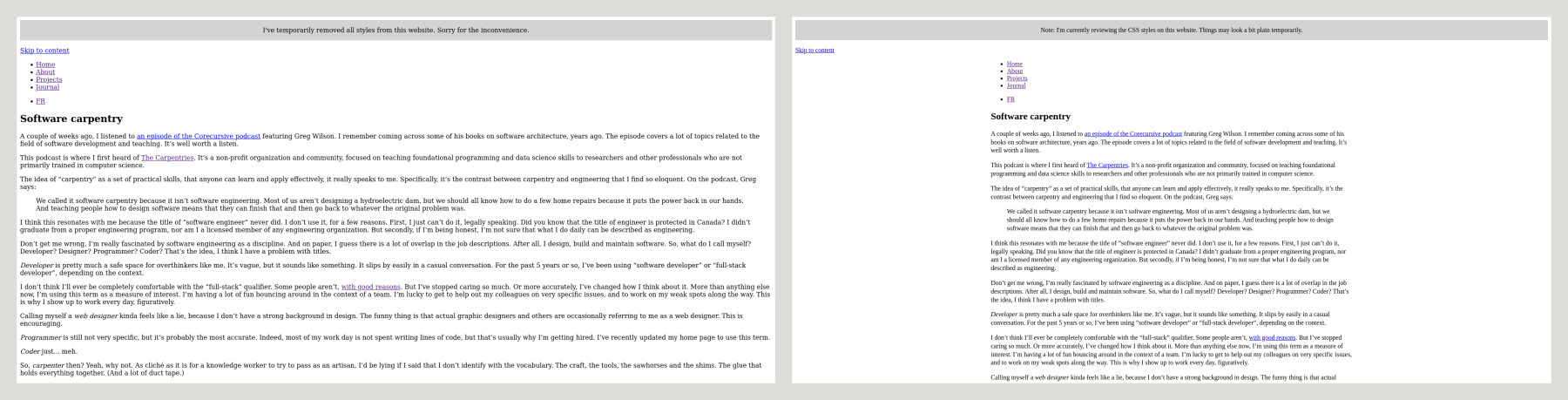
Today, I removed almost all styles and scripts. I’ll take some time this week, starting with the HTML foundation. I want to iron out a few wrinkles at the semantic level, anything that can negatively impact accessibility, and add back just enough CSS to make it pleasant.
I’ll update this post with some thoughts along the way.
Updates
day 2
The first thing I’m noticing is just how useable a plain HTML page is! Maybe it sounds ridiculous, but I realize I’m somehow set in my ways... These days, I rarely start with a blank page without any styling.
Things look especially good on mobile, but there are a few wrinkles on larger screens. The usual suspects: long lines of text stretch all the way across the screen, images are out of proportion, spacing is generally off, etc. I’ve added just a few lines of CSS to shape things up:
There are some interesting surprises. I was leaning on a feature of the font I was using to create special symbols by combining characters. For example, the - and > characters would render as an arrow pointing right. I don’t know if I’ll get back to this font, so I’ve removed those for now. In the context of a website, it probably makes more sense to use Unicode characters for symbols, or small SVG illustrations with a title element for accessibility.
Overall, most pages look pretty good without CSS, except for the Projects page. This is probably the one I’ll need to rework entirely. I was using a bit of JavaScript to create a custom listing, with a click-to-expand type of effect. I might be able to replicate this with a details HTML element, I’ll experiment. It’s probably a good opportunity to explore CSS Grid to find a simple layout that works with all items visible.
day 3
The plain look is definitely growing on me. However, it’s tempting to add hr and br elements everywhere to control the spacing. Line breaks are a big no-no for spacing, so I won’t do that. The best tools for spacing in plain HTML are probably (drum roll...) titles and paragraphs. The horizontal rule is still tempting though, as long as it indicates a “thematic break” in the flow of the content.
While on the topic of breaks, the first breakup in this experiment is with Tailwind CSS. I’ll start by saying that I still like Tailwind. I think the utility-first approach has a lot of merits, especially on larger projects. It was eye-opening for me to explore, through Tailwind, the value of styles as a system of composable primitives.
That being said, it does feel a lot like work... I’ve been using Tailwind at work for about 5 years now, and I think it’s been keeping me away from exploring some of the new stuff available in CSS.
Anyway, I’ve removed all Tailwind classes from the markup, and it feels pretty good. I won’t miss some of the strange contortions needed to express more advanced CSS ideas in the form of classes, stuff like: md:grid-cols-[auto,1fr]. Thankfully, Tailwind is as easy to remove as it is to add in the first place. It’s all just classes. (A lot of classes...) At this point, I’m pretty motivated to remove the entire front-end “build” process with it.
day 4
I’ve cleaned up the remaining empty div elements, data- attributes and other traces of previous experiments.
I’m not a graphic designer, but I like to use Inkscape to brainstorm visual ideas. I’ve used it a lot for this website. However, if my goal is to write more, I think I should put off all design experiments for now, because these are usually a big source of distraction for me. That’s where I get bogged down in web projects because I don’t feel confident in my design abilities.
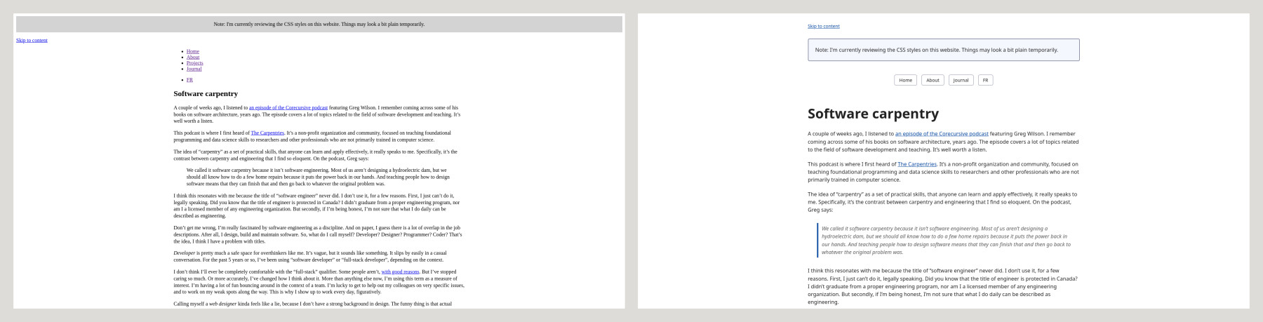
I started looking at some of the minimal, classless CSS templates out there. I think I’ve landed on simple.css. I’ll surely customize it over time, but it seems like a super good starting point:
day 5
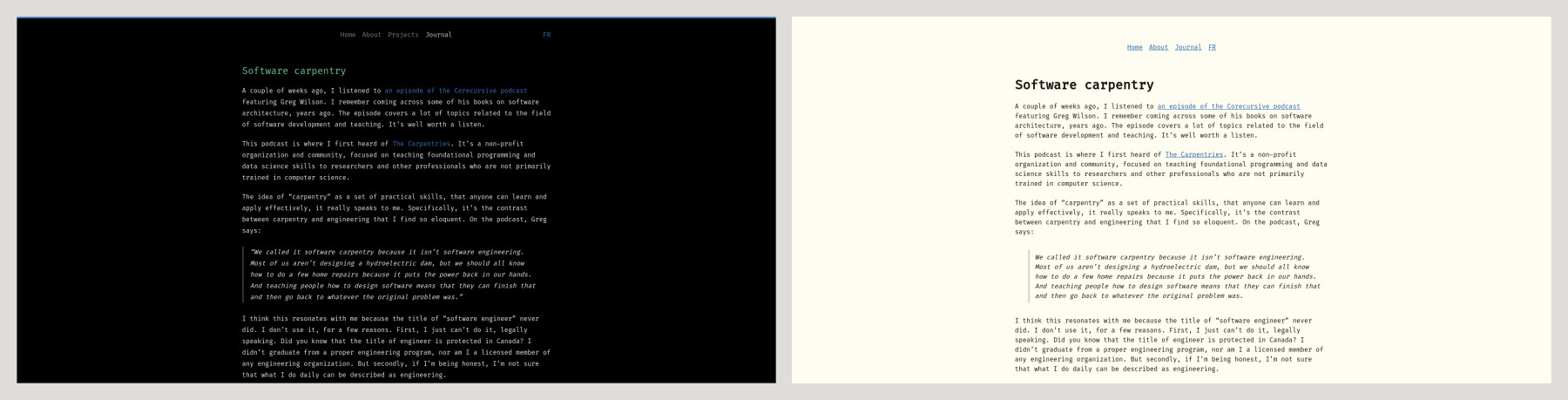
I’m wrapping up this little experiment. I have customized the base styles of simple.css a bit more to my liking. It gives me a base layer that is (subjectively) better than the browser defaults, with decent support for dark mode.
I’ve also introduced the Flexoki colour palette. I’ve been considering it for some time while stuck with the thought of creating my own. Again, I need to remove some of the typical distractions that get in the way.
I’ve reintroduced the Fira Code font, which I’ll admit I have missed throughout the week.
I realize that I’m ending very close to where I started... but with a much lighter HTML and CSS foundation: